Redesigning WP Statistics for clearer insights and reporting
Timeline
2025
PLATFORM
WordPress Plugin
MY ROLE
Product Designer
Overview
WP Statistics is a used WordPress analytics plugin for site owners who want traffic insights without sending data to external services. Over time, the interface fell behind user needs and the growing complexity of the product. I led the redesign to create a clearer information architecture, a unified component system, and a more predictable reporting experience that can scale with future features.
Context
The plugin has evolved over many years and collected UI patterns from different eras and contributors. As a result, reporting workflows became harder to follow and the layout felt inconsistent across screens. This made it difficult for users to interpret their traffic data and slowed down updates for developers.
At the same time, the development team was modernizing parts of the codebase and needed a stable design foundation to build on. The redesign needed to address both sides: giving users a clearer experience and giving developers a cleaner, more predictable workflow.
The problem
What was breaking
Several issues made the existing experience difficult for both users and the team:
- Reporting pages displayed large amounts of information without a clear structure or hierarchy.
- Similar UI elements behaved differently across screens.
- Navigation pathways to high-value reports required unnecessary steps.
- The plugin lacked a unified spacing, layout, and component logic, which slowed both understanding and development.
What was at risk
Analytics products rely on clarity and trust. When key metrics are hard to scan or reach, users lose confidence. For developers, the absence of shared patterns led to duplicated work and slower release cycles. Improving the reporting experience and the underlying system was essential to keeping the product usable and maintainable.
Constraints
These were the boundaries shaping the redesign:
- The interface had to remain familiar to long-time WordPress users.
- The data model could not change during this phase.
- The plugin needed to perform well across many hosting environments.
- The redesign had to fit within a component-driven approach that developers could adopt without increasing complexity.
- The visual direction had to align with WordPress conventions while still feeling modern.
Strategy
My approach was to rebuild the experience from the foundation instead of applying visual polish to individual screens. The strategy focused on:
- Creating a clear information architecture that reduces cognitive load.
- Establishing consistent spacing, hierarchy, and layout patterns across all reporting views.
- Building a reusable component system using shadcn and Tailwind removes guesswork.
- Making high-frequency reporting tasks easier to complete without unnecessary navigation.
- Prioritizing clarity over unnecessary visual complexity to maintain trust.
Key decisions
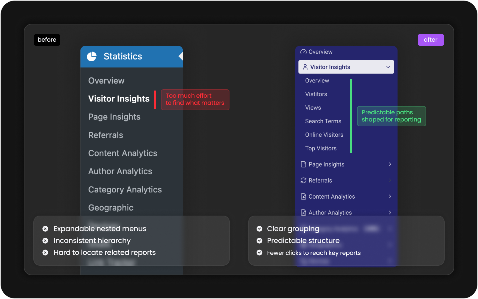
Information architecture
I reorganized the reporting structure so related insights sit together in a way that matches how users naturally think about website traffic. This reduced unnecessary navigation and established a cleaner mental model for reading reports.
Component system
I created a reusable component system for cards, tables, filters, navigation items, alerts, and layout grids. It removed inconsistencies across pages and gave developers a reliable foundation for building future reporting modules.
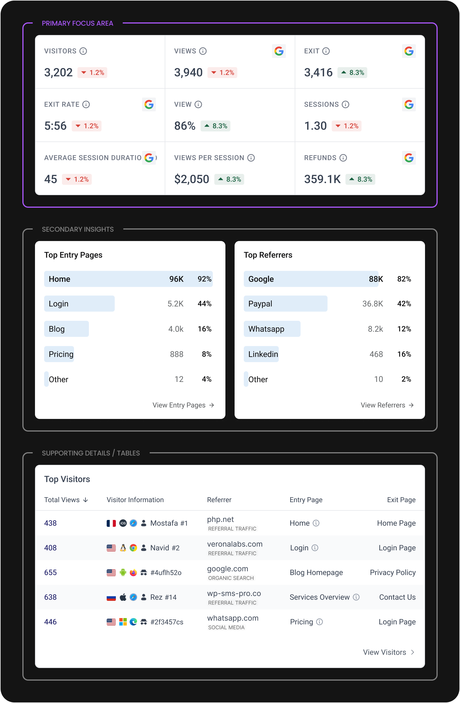
Data hierarchy
Analytics tools often become noisy. I focused on giving the primary metric on each screen the clarity and space it needs, while placing secondary information in predictable, low-friction positions.
Navigation model
I simplified the pathways to key reports. Instead of drilling through layers, users can now reach high-value screens directly from the main navigation, reducing steps and improving orientation.
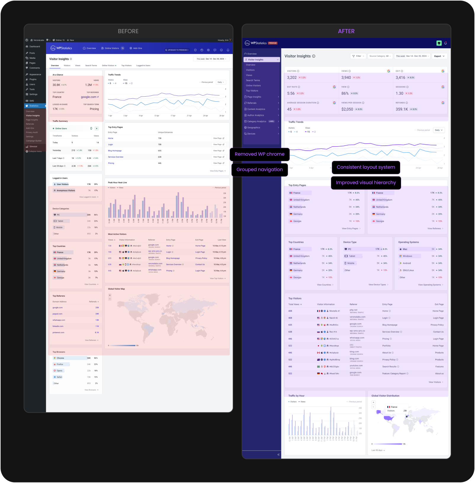
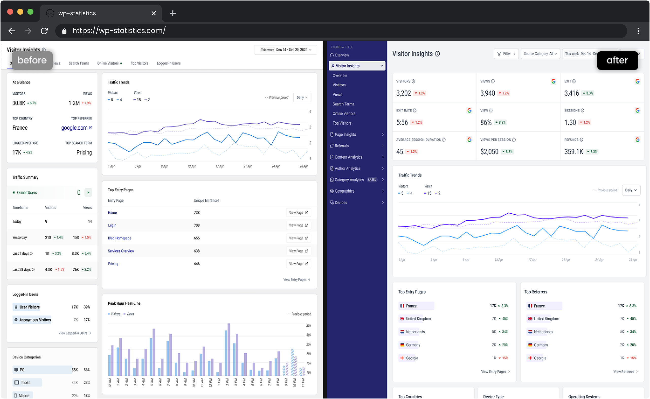
Final design
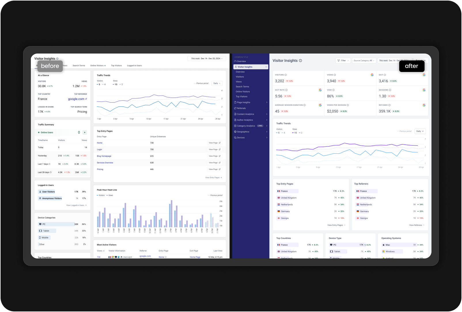
Before and after
Here's how the Visitor Insights page evolved from the original WordPress implementation to the new dedicated analytics interface.
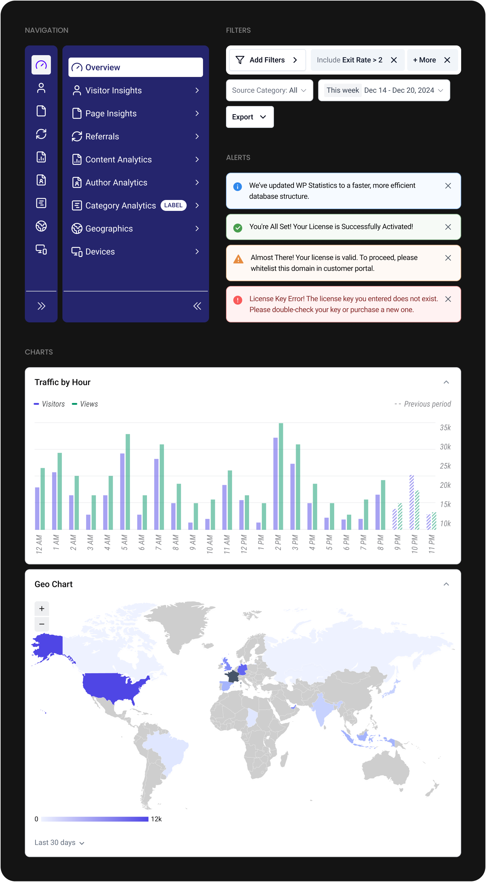
Reporting pages
The redesigned reporting pages follow a consistent rhythm. Primary metrics appear upfront, with secondary details and tables to reduce scanning and keep focus on what matters.
Components
Each component was rebuilt for consistency and readability. The new system gives the development team a shared foundation that speeds up implementation and keeps new features visually aligned.
Navigation
Clearer grouping and more intuitive labels make navigation easier for both first-time and returning users. The structure helps users understand where insights live without hesitation.
Outcomes
This redesign is preparing for release, so real-world product metrics aren’t available yet. After launch, we’ll track key indicators to understand how well the new structure supports users and the business.
- Time to complete common reporting tasks
- Number of support tickets related to layout, navigation, or confusion
- Developer time required for UI-related fixes
- Click depth to reach high-value reporting screens
- Adoption of features enabled by the new component system
These metrics will help validate whether the IA, layout, and navigation improvements translate into measurable user and team value.
During testing, feedback from WordPress users unfamiliar with the plugin helped refine hierarchy, naming, and navigation patterns before release.
My role
I led the redesign from framing to delivery. My work included:
- Mapping inconsistencies across the existing plugin
- Defining the new information architecture
- Creating the component system used by developers
- Designing the full reporting experience
- Aligning decisions with product and engineering
- Running collaborative reviews across the team
- Guiding feasibility decisions to ensure smooth implementation
Learnings
- In long-running products, inconsistencies accumulate into user and development problems.
- A strong component system is both a design asset and an engineering advantage.
- Clarity in data hierarchy has a greater impact than complex visuals.
- Validating labels and wording early prevents confusion later in the flow.
Next steps
- Monitor early usage and user behavior after launch
- Expand the component system for upcoming features
- Explore future reporting patterns such as segmented trends and comparative insights
- Evaluate opportunities for improving mobile experiences if usage patterns shift
Redesigning WP Statistics for clearer insights and reporting
Timeline
2025
PLATFORM
WordPress Plugin
MY ROLE
Product Designer
Overview
WP Statistics is a used WordPress analytics plugin for site owners who want traffic insights without sending data to external services. Over time, the interface fell behind user needs and the growing complexity of the product. I led the redesign to create a clearer information architecture, a unified component system, and a more predictable reporting experience that can scale with future features.
Context
The plugin has evolved over many years and collected UI patterns from different eras and contributors. As a result, reporting workflows became harder to follow and the layout felt inconsistent across screens. This made it difficult for users to interpret their traffic data and slowed down updates for developers.
At the same time, the development team was modernizing parts of the codebase and needed a stable design foundation to build on. The redesign needed to address both sides: giving users a clearer experience and giving developers a cleaner, more predictable workflow.
The problem
What was breaking
Several issues made the existing experience difficult for both users and the team:
- Reporting pages displayed large amounts of information without a clear structure or hierarchy.
- Similar UI elements behaved differently across screens.
- Navigation pathways to high-value reports required unnecessary steps.
- The plugin lacked a unified spacing, layout, and component logic, which slowed both understanding and development.
What was at risk
Analytics products rely on clarity and trust. When key metrics are hard to scan or reach, users lose confidence. For developers, the absence of shared patterns led to duplicated work and slower release cycles. Improving the reporting experience and the underlying system was essential to keeping the product usable and maintainable.
Constraints
These were the boundaries shaping the redesign:
- The interface had to remain familiar to long-time WordPress users.
- The data model could not change during this phase.
- The plugin needed to perform well across many hosting environments.
- The redesign had to fit within a component-driven approach that developers could adopt without increasing complexity.
- The visual direction had to align with WordPress conventions while still feeling modern.
Strategy
My approach was to rebuild the experience from the foundation instead of applying visual polish to individual screens. The strategy focused on:
- Creating a clear information architecture that reduces cognitive load.
- Establishing consistent spacing, hierarchy, and layout patterns across all reporting views.
- Building a reusable component system using shadcn and Tailwind removes guesswork.
- Making high-frequency reporting tasks easier to complete without unnecessary navigation.
- Prioritizing clarity over unnecessary visual complexity to maintain trust.
Key decisions
Information architecture
I reorganized the reporting structure so related insights sit together in a way that matches how users naturally think about website traffic. This reduced unnecessary navigation and established a cleaner mental model for reading reports.
before

Expandable nested menus
Inconsistent hierarchy
Hard to locate related reports
Too much effort
to find what matters
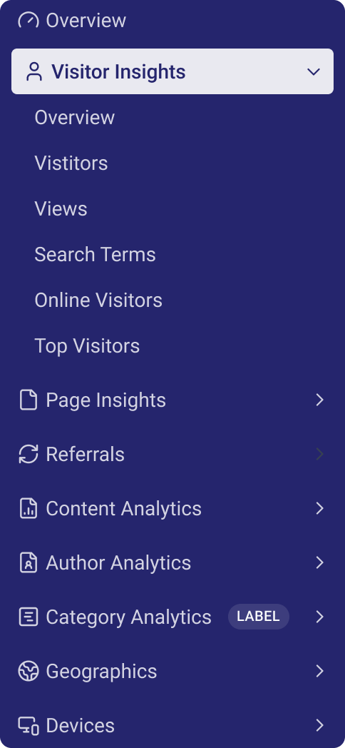
after

Clear grouping
Predictable structure
Fewer clicks to reach key reports
Predictable pathsshaped for reporting
Component system
I created a reusable component system for cards, tables, filters, navigation items, alerts, and layout grids. It removed inconsistencies across pages and gave developers a reliable foundation for building future reporting modules.
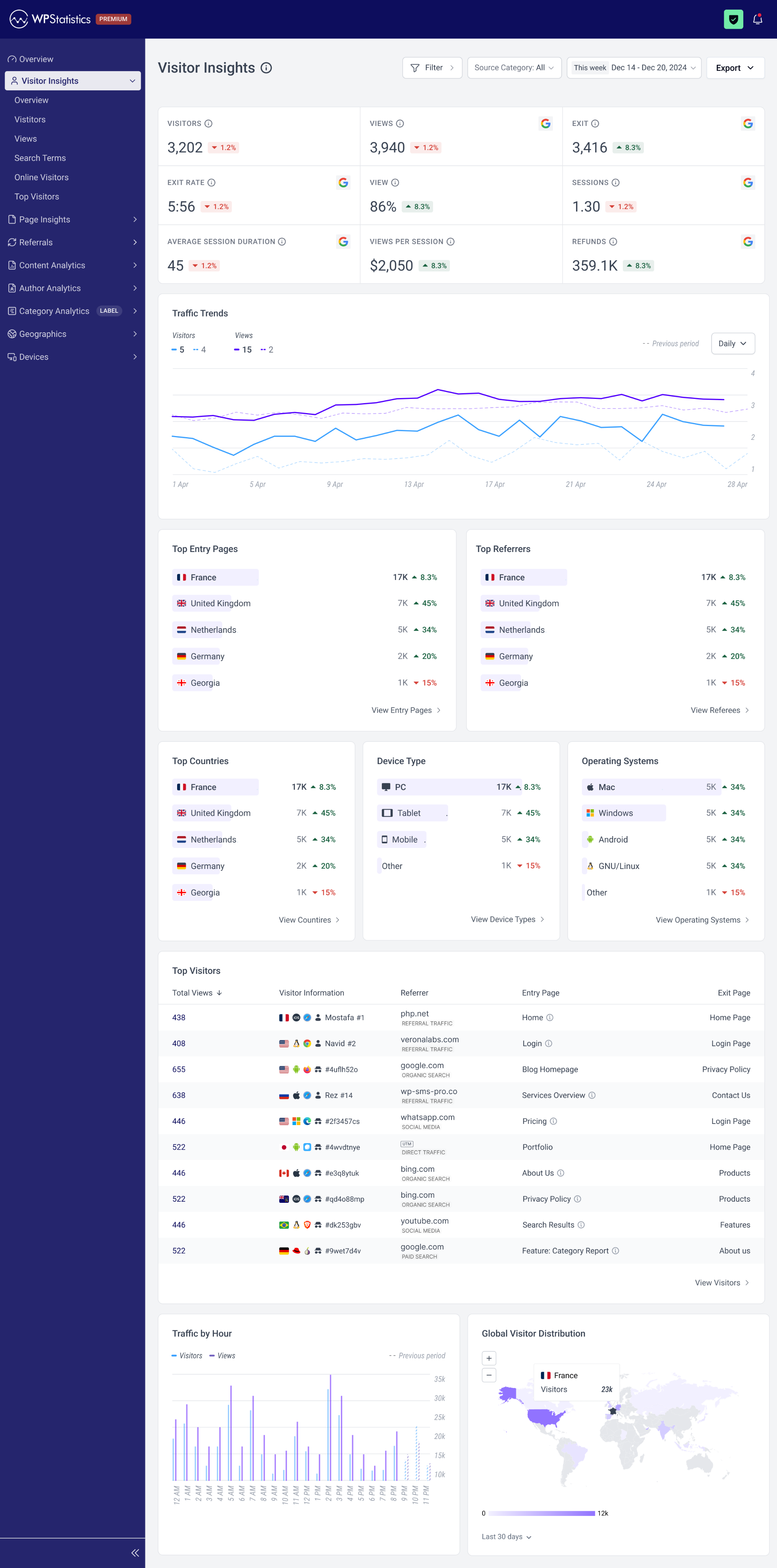
Data hierarchy
Analytics tools often become noisy. I focused on giving the primary metric on each screen the clarity and space it needs, while placing secondary information in predictable, low-friction positions.
Primary focus area
Visitors

3,202

1.2%
Views


3,940
1.2%
Exit
3,416

8.3%
Exit rate
5:56
1.2%
View
86%
8.3%
sessions
1.30
1.2%
average session duration
45
1.2%
Views Per Session
$2,050
8.3%
Refunds
359.1K
8.3%
Secondary insights
Top Entry Pages
Home .
96K
92%
Login .
5.2K
44%
Blog .
4.0k
16%
Pricing
888
8%
Other
12
4%
View Entry Pages

Top Referrers
Google .
88K
82%
Paypal... .....
36.8K
42%
Whatsapp .
8.2k
12%
468
16%
Other
10
2%
View Referrers
Supporting details / tables
Top Visitors
Total Views

438
408
655
638
446
Visitor Information


Mostafa
#1


Navid
#2


#4uflh52o


Rez
#14


#2f3457cs
Referrer
php.net
Referral Traffic
veronalabs.com
Referral Traffic
google.com
Organic Search
wp-sms-pro.co
Referral Traffic
whatsapp.com
Social Media
Entry Page
Home

Login
Blog Homepage
Services Overview
Pricing
Exit Page
Home Page
Login Page
Privacy Policy
Contact Us
Login Page
View Visitors

Navigation model
I simplified the pathways to key reports. Instead of drilling through layers, users can now reach high-value screens directly from the main navigation, reducing steps and improving orientation.
Final design
Before and after
Here's how the Visitor Insights page evolved from the original WordPress implementation to the new dedicated analytics interface.
before
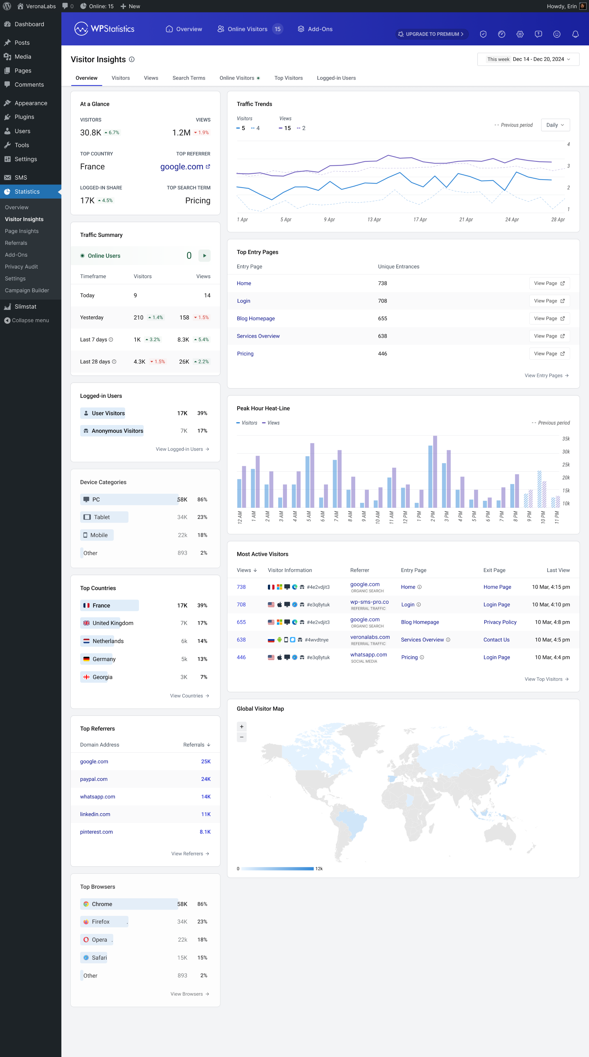
after
Removed WP chrome
Grouped navigation
Consistent layout system
Improved visual hierarchy
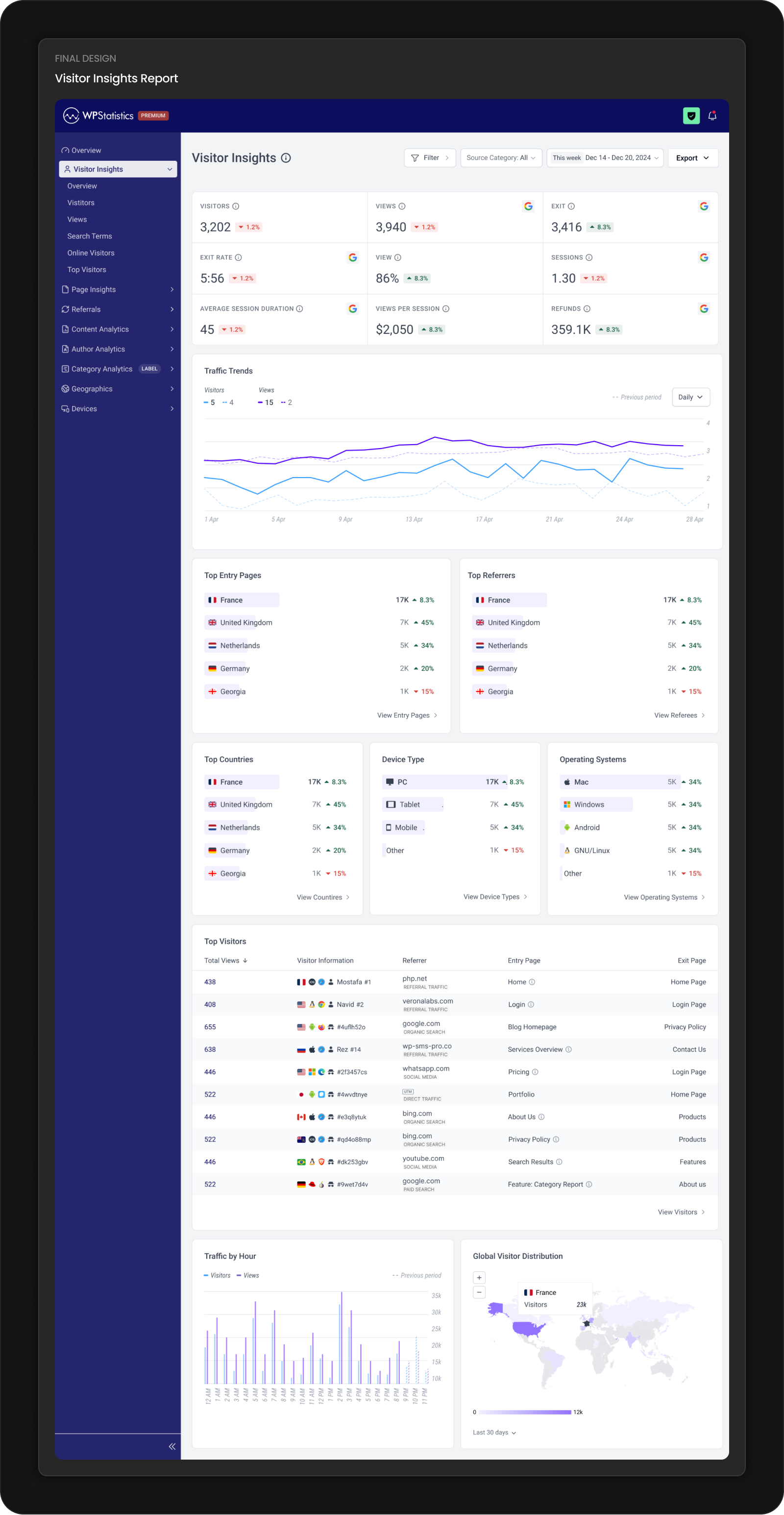
Reporting pages
The redesigned reporting pages follow a consistent rhythm. Primary metrics appear upfront, with secondary details and tables to reduce scanning and keep focus on what matters.
Final Design
Visitor Insights Report
Components
Each component was rebuilt for consistency and readability. The new system gives the development team a shared foundation that speeds up implementation and keeps new features visually aligned.
Navigation
Clearer grouping and more intuitive labels make navigation easier for both first-time and returning users. The structure helps users understand where insights live without hesitation.
Outcomes
This redesign is preparing for release, so real-world product metrics aren’t available yet. After launch, we’ll track key indicators to understand how well the new structure supports users and the business.
- Time to complete common reporting tasks
- Number of support tickets related to layout, navigation, or confusion
- Developer time required for UI-related fixes
- Click depth to reach high-value reporting screens
- Adoption of features enabled by the new component system
These metrics will help validate whether the IA, layout, and navigation improvements translate into measurable user and team value.
During testing, feedback from WordPress users unfamiliar with the plugin helped refine hierarchy, naming, and navigation patterns before release.
35% fewer interaction steps
Reduced hops between reports
3-level information architecture
Clear grouping for faster navigation
Fully grid-aligned layout
Consistent spacing across all modules
My role
I led the redesign from framing to delivery. My work included:
- Mapping inconsistencies across the existing plugin
- Defining the new information architecture
- Creating the component system used by developers
- Designing the full reporting experience
- Aligning decisions with product and engineering
- Running collaborative reviews across the team
- Guiding feasibility decisions to ensure smooth implementation
Learnings
- In long-running products, inconsistencies accumulate into user and development problems.
- A strong component system is both a design asset and an engineering advantage.
- Clarity in data hierarchy has a greater impact than complex visuals.
- Validating labels and wording early prevents confusion later in the flow.
Next steps
- Monitor early usage and user behavior after launch
- Expand the component system for upcoming features
- Explore future reporting patterns such as segmented trends and comparative insights
- Evaluate opportunities for improving mobile experiences if usage patterns shift